
Most forecasts are wrong. They can be especially wrong when confronted with an extremely dynamic economy, constantly shifting competitor offerings and customer preferences, and myriad natural disasters — not to mention a pandemic. Supply chain professionals often further complicate the forecast by making frequent changes to strategy, insisting on lightspeed product development, or creating a proliferation of stock-keeping units (SKUs).
Good forecasts also have many limitations. More sophisticated forecasting techniques tend to hide the assumptions built into the forecast; even if they were identified and understood when the model was built, they are soon put aside and forgotten. This reduces understanding and may reduce acceptance of the forecast. Additionally, the forecast may be designed for a specific time horizon, such as the tedious annual budget, but the world is not static for a year. Also, many forecasts are generic and may not be created for the SKU for which we need a decision.

Even when we are confident that the critical forecast variables are known and the time horizon is reasonable, forecasts are still often wrong because so much of what is understand is not accurately quantifiable. For instance, management may know that a new product is being well received — but to what degree? And for how long? A forecasting system that allows decision-makers to readily adjust to these unknown, often subjective, factors would be nice. So, let’s give them a tool that makes them comfortable with the dynamics and subtleties that they know are taking place in the market now and enables them to generate forecasts rapidly and easily. Better yet, make it understandable to team members to they believe in and accept the numbers. Finally, create a forecasting procedure that lends itself to both incorporating new information and enhancing the forecasting process itself. Optimistically, a good forecasting vehicle should not only facilitate timely forecasts, understanding and acceptance, but also contribute to the development of an improved overall process.
Enter stagger charts
Stagger charts are easily prepared and understood using a simple spreadsheet, so they lend themselves to widespread participation. They are also an effective tool for forecast evaluation and after-forecast discussions that are a necessary component of a good process. Here’s how they work:
Data sources: Stagger charts place few constraints on sources of data. They do not preclude the use of data from sophisticated models — or even a less-sophisticated model, such as the sales manager’s opinion. Marketing, sales, purchasing and production personnel can generate initial data for stagger charts any way they like. The marketing input can be from sales force composites, marketing management or a jury of executive opinion. Alternatively, the people in charge of operations research can build a multiple regression model with numerous variables and use that data as input. Having participants in the forecasting process prepare their own input has the advantage of helping people learn more about their own forecasting ability. This kind of participation (and subsequent analysis) may indicate a conservative or optimistic bias on the part of the forecaster that enriches both their understanding and the forecasting process itself.
Time units: The typical stagger chart takes raw forecast data and builds a structured monthly presentation, but data can also be weekly or quarterly. Stagger chart forecasts are rolling, made each month for each of the next several months, which keeps them fresh. Monthly data is typically preferred because weekly data tends to be too erratic, and quarterly forecasts may not provide the accuracy desired for the master production schedule. The determining factor for the length of the forecast in a production setting is usually the lead time required by the master schedule. Order size and frequency also may suggest a time unit other than a month.
Product or product families (units or dollars): Although stagger charts can be for just one product, they can also be for families of products. Forecasts of product families tend to be less volatile and more accurate than individual forecasts; however, they may also be less useful to the production planner. Similarly, the production process may find units more useful than dollars, but stagger charts lend themselves equally well to both. Consequently, stagger charts permit the forecasting team to focus on products or families, units or dollars.
Standards: Using stagger charts provides for easy comparison of forecasts against standards. Comparisons are an important and major contribution of the technique. Comparisons give forecasters an effective way to evaluate the rolling forecast. These standards might be annual budget plan, average sales for a period in recent years or sales booked. Industry practice and the data available may suggest the use of other standards. Comparisons to standards such as these provide an objective measure against which to evaluate the forecast.
Stagger chart interpretation
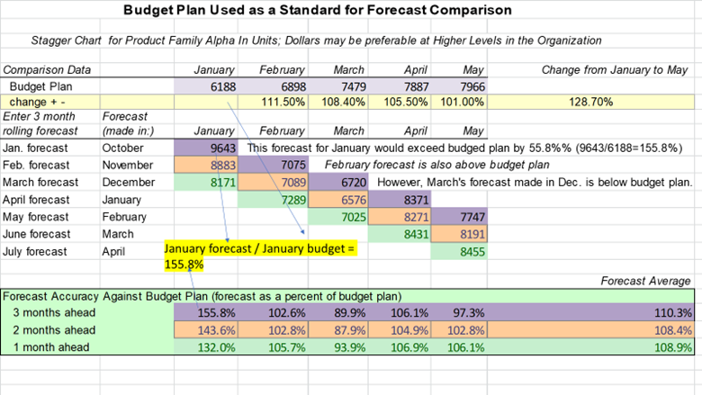
Figure 1 shows a stagger chart for a five-month period with a rolling three-month forecast. Here the rolling forecast is evaluated against a comparable period of the annual budget plan. The forecasts, initially made in October and continued through April, are significantly and consistently high for January, but below the budget plan for March. The variations between the annual budget plan and the forecast suggest that a reevaluation of at least the January and March plans may be appropriate.
That evaluation might ask:
- In what way are the assumptions of the forecasts made in October, November and December different from those used when the annual budget plan was prepared?
- What do we know now that we did not know then?
- Have we had a significant change in demand due to the economy, interest rates, weather, etc.
Such ponderings are one of the strengths of stagger charts: The data is presented for decision-makers to see, discuss and evaluate.
Figure 1
Incorporating additional standards into a single spreadsheet may also be helpful. There are many possible standards: The three added in Figure 2 are: historical averages, booked orders and actual sales. Comparing January’s forecast against the average, we see that the January forecast made in October was 160.7% of the average for the month. As lead time is reduced from October to December, the forecasts trend lower, but they still remain optimistic at 136.2%. A subsequent comparison to actual sales (shown at the bottom of Figure 2) indicates that some optimism was justified.
Figure 2
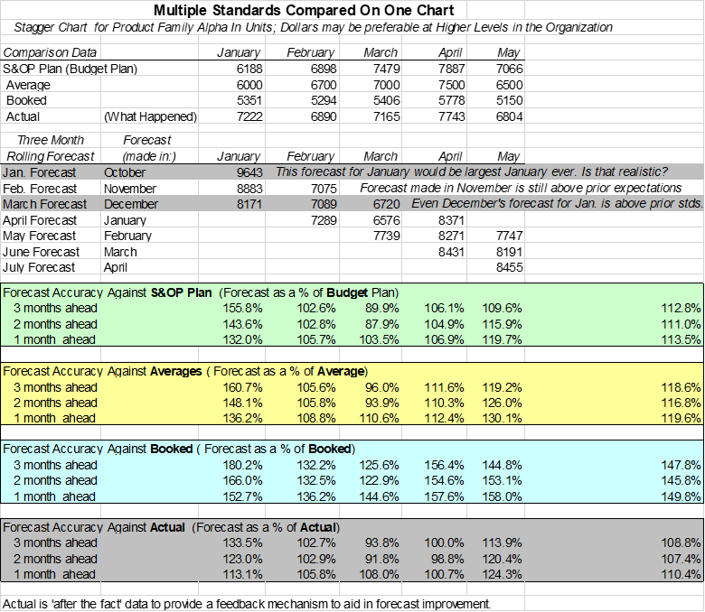
Evaluation of forecasts against orders booked can be helpful when the booking patterns are well established. For instance, if management knows that, historically, by the 10th of each month they have two-thirds of the orders they will receive for the following month, then that may become a good leading indicator of forecast accuracy.
The actual sales included in Figure 2 add a post-forecast evaluation perspective. This after-the-fact analysis provides another perspective for evaluation, learning and forecast process improvement. Note that, while the January forecasts — when compared to budget plan, average and booked — appear optimistic, they are somewhat less hopeful than when compared to actual. Perhaps our forecasters had information that was unavailable when the budget plan was initially developed.
Stagger charts allow us to evaluate forecasting performance by providing unambiguous comparisons and insight that should improve the process. Because so much forecasting is tied up in optimism or pessimism about products, knowledge of customers, information about competitive actions and reactions, and even personality and human interaction, direct feedback to the forecasting process is a significant stagger chart advantage. This self-correcting feature is a wonderful attribute that allows feedback to be provided in a non-threatening way by dispensing with the esoteric nature of many forecasting techniques. Consequently, the technique aids in enhancing subsequent forecasts. Indeed, stagger charts provide a great way to understand and evaluate the reasonableness of the data. They enhance understanding and participation, which leads to ever better forecasts.
Although we have included several standards in one spreadsheet, a separate spreadsheet for each standard, prepared and evaluated independently, may occasionally be useful. The caution here is not to overwhelm the users with data. User understanding of the process and assumptions, followed by subsequent evaluation, are major advantages of stagger charts.
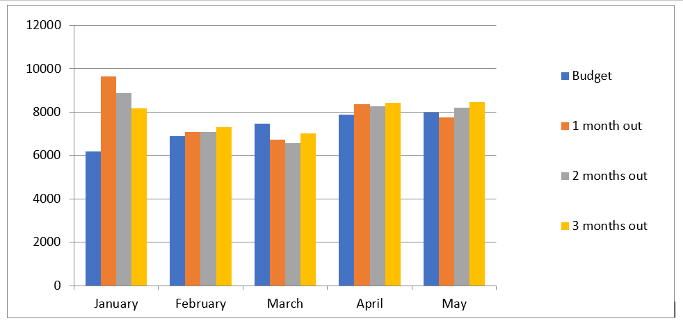
Figure 3 moves our spreadsheet forecasts to an alternative presentation: a graph. Some users may find that a data visualization provides a helpful perspective. Note that the three optimistic January forecasts are obvious in a graphic presentation, just as the March forecasts are obviously lower than the budget plan. Management should be asking: What are the forecasts telling us about the January Budget Plan? Are we prepared for the substantial January increase.
On the other hand, the forecasts for March are consistently low. Does this suggest that cuts are appropriate for March? Further investigation of the January and March forecasts may be warranted.
Figure 3
Stagger charts are economical, easy to develop and easy to use. They enhance our ability to audit and perhaps validate forecast accuracy against a variety of standards. And they can bring an appreciation and enhancement of the forecasting exercise for the long-term benefit of the organization.
We are excited to announce that our Certified in Production and Inventory Management (CPIM) credential is now Certified in Planning and Inventory Management (CPIM)! While planning has always been integral to CPIM, the new name better reflects this as a competency. Earn your CPIM today!